Just another simple dashboard
May 7, 2015
Nobody would refute that a dashboard is useful [1]. So why do we see so few of them in real life ?
Of course, there are many ready-to-use projects you can start from to build your dashboard. Even ascii ones ! And you can build your own from scratch. So why don't we see more of screenshots of the way mobile developers keep track of their everyday job ?
Maybe all of us have dashboards but the numbers are so bad, we are ashamed to show them. Maybe those numbers are so good we would look like bragging. Maybe the metrics are so sensitive that if our concurrent could have just a peek at them, we would fall behind in the race to be the next Facebook.
Meh.
What I believe is dashboard are frigging hard/expensive to set up. Start from scratch and you will have to re-invent the wheel to end with something ugly. Take an already existing project and you lose time learning to think like its creators.
So why is it so hard ?
- We want something beautiful. As developers, we generaly don't think too much into aesthetics, but as the sole purpose of the dashboard is to be seen (no interactions), we understand that it need to be at least clear and meaningfull, but also pleasant to the eye. And we are no graphic designer.
- We need to deal with differents data sources. SCM and CI servers, some monitoring of the app in production, a bit of agility, maybe from differents networks, all mixed in a single window !
- "Just displaying" datas can't be that hard, can it ? So it's likely that the management will give you a third or a fourth of the time really needed.
- And we may want manual inputs as well ! Endless troubles !
How to make it less painfull ?
What follows is certainly not the best, most elegant, solution of all time. But It Just Works©. We had to deal with every problems listed before. So here's how we did it.The front-end.
Not starting from scratch, not using an existing framework, but something in the middle: a webapp template, without any logic code inside. A simple, but beautiful plain dumb display. AdminLTE from Almsaeed Studio was our pick.
To be able to develop the front-end, we use an intermediate datasource. We can mock up our data and even divide the . Simple and effective to fake data and check the behavior of your dashboard as the data changes. Parse is the perfect choice for this.
The secret to make everything as simple as possible is to not use any application server. Nothing rendered server-side. Just a local webapp. So the deployment of the dashboard on any computer is minimal.
The "middleware"
Plain Old Shell Script. With curl[2]. Launched by a jenkins job or cron. Dead simple, dead effective. And it uploads the metrics in Parse.
The "back-office"
This is merely exposing an HTTP endpoint from you real datasources. But here is another trick: by using an intermediate datasource, you can make an app (what about a mobile app for example) to update any metrics in your dashboard. Once again, using something like Parse is a real time-saver, but any other similar services will do the trick.
The metrics
So, what to display ? As it was once said: «a picture is worth a thousand words» so here it what we use:
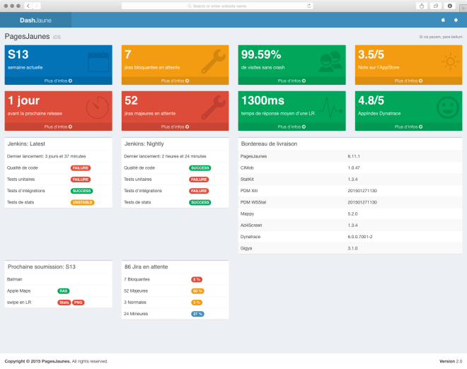
And of course, it is responsive, but that is thanks to Almsaeed Studio.

[1] : if you display meaningless metrics on your dashboard, it isn't a dashboard, it's just a waste of pixels and time. [2] : easiest way to deal with proxy, and you can prototype your script in ... the shell ! woot \o/